From Hours to Minutes: Redesigning Grant Review for Speed and Unbiased Decisions
Decrease the time it takes to review a grant request, while improving upon secondary metrics, if possible
Overview
Grant reviewers were stuck in inefficient, context‑losing workflows that took hours per request and risked biased decisions from visible peer reviews. I framed this as a dual problem of throughput and decision quality, led research, partnered with PM/Eng, and coached the team on evidence‑based iteration, cutting review time to minutes and enabling parallel work while improving the fairness of the requests being reviewed.

Problem
- Operational bottleneck: Reviewers took ~2 hours per request and could handle only a few per session.
- UX friction: Had to jump between request details and a separate review page, losing context.
- Bias risk: Peer reviews/comments visible before forming their own opinion, leading to groupthink.
- Business impact: Slowed grant programs, frustrated admins, inconsistent outcomes.
Discovery & Framing
Led interviews with reviewers/granting program admins, and reviewed support tickets and session recordings.
- Insight: Reviewers needed narrative hierarchy (risk, impact, details), not form order.
- Research tie‑in: Brought academic whitepapers on independent evaluation and the value of anonymity that showed how groupthink, attribute substitution, authority bias, and other biases the current process was prone to, reduced decision diversity and quality.
- Leadership move: I coached the team to frame it as “throughput + quality” rather than “faster UI.” I also defined success: time per review, parallel capacity, and confidence scores. This helped frame more meaningful questions for the team moving forward.


Examples of several existing research papers referenced to influence stakeholder and team position.
Strategy & Partnership
Approach: Inline context of the review + enforced independence (only influenced by another user in the review process when that was explicitly something that should happen, e.g. an expert weighing in).
- Partnered with Eng: feasible multi‑tab architecture, safe data isolation.
- Phased rollout: restructure details → inline review → peer review hiding. This helped test early and often with end-users to minimize risk.
- Coached Designers and PMs on balancing “speed vs. rigour” using OKRs.
- Began training a UI designer on UX, interaction design, and research.
Solution
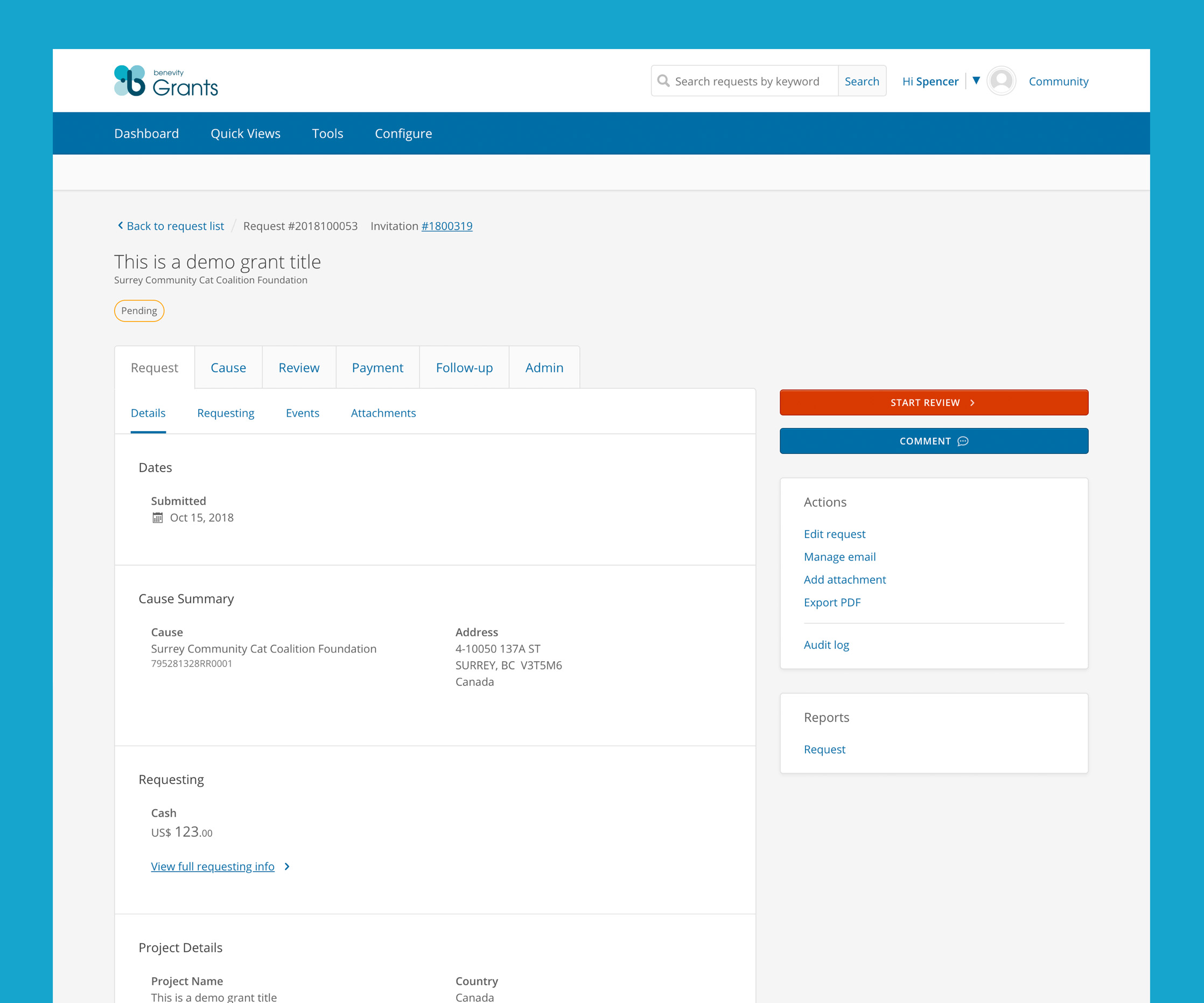
- Restructured details: Matching a reviewer’s mental model (eligibility flags, risk signals, narrative summary) instead of just a spew of details.
- Inline review panel: Score and comment without leaving the review context; supports multiple open tabs.
- Independence rule: Submit your review before seeing peers’ (with in‑product rationale).

Complete information architecture work-up and navigation redesign.

Dashboard to direct reviewers and admins alike to the right action at the right time.

Inline “toast” style review panel keeps reviewers organized, preventing losing of context, especially when reviewing multiple grants at a time.
Outcomes
- Time per review: ~2 hours → a few minutes.
- Capacity: 1–2 concurrent reviews → multiple.
- Reviewers: more confident, less influenced; admins saw higher throughput.
- Team maturity: Learned research‑backed process changes; applied to other flows.