20 Requests in Seconds: Operational Leverage at Scale
Decrease overall granting time by improving categorization and enable bulk processes
Overview
Grant admins spent hours on mechanical updates (5–20 min per request × 20+ at a time), when they may have several details in common for quicker categorization, bottlenecking program scale. I quantified the ops debt, built the business case despite resistance, and led bulk actions design with Engineering, turning hours into seconds and freeing time for more strategic work.

Problem
- Manual drudgery: Open each request, apply action (status/email), save, repeat.
- Scale limit: Large programs overwhelmed admins; error risk was high.
- Hidden cost: Hours/week lost; no visibility into total ops overhead.
Discovery & Business Case
- Observed in sessions: estimated 100+ hours/program cycle wasted.
- Interviews: admins wanted “batch everything” or a similar way to group and categorize like items.
- Leadership move: Framed as platform infrastructure: “No bulk = growth ceiling.” Presented to PM/Eng with hours saved for admins and requests removed for Benevity support, solid math to secure prioritization.

Collection of and synthesis of large swaths of researched information across many areas.

Example of mapping existing flows into service blueprints to better articulate needs to stakeholders.

Example of breaking larger interaction design down into smaller work tickets that are easier to test and measure.
Strategy & Partnership
Approach: Safe, discoverable bulk ops.
- Eng collaboration: selection models, permissions, audit logs.
- Scoped MVP: I broke down Quick Views features into bite-sized stories, such as status changes, a new checkbox component, overlays, and more (starting with the safest and highest-return first).
- Coached team: “Leverage > perfection; measure adoption first.”
Solution
- List‑level multi‑select: Checkboxes, “select all matching filter,” count preview.
- View settings: Quickly sort items based on complex categorization criteria.
- Action drawer: Clear labels, safeguards (e.g., “20 requests will change status”).
- Feedback: What can and can’t be undone, an undo buffer, activity/audit logs.

Initial quick categories and view settings for grant requests helped people find what they needed to more efficiently.

The bulk action pattern was then easily replicable to other areas than just Quick Views, like making payments.

Rearranging and control over columns of data allowed a level of personalization for outlier admins or niche tasks.

Various options available for bulk editing.
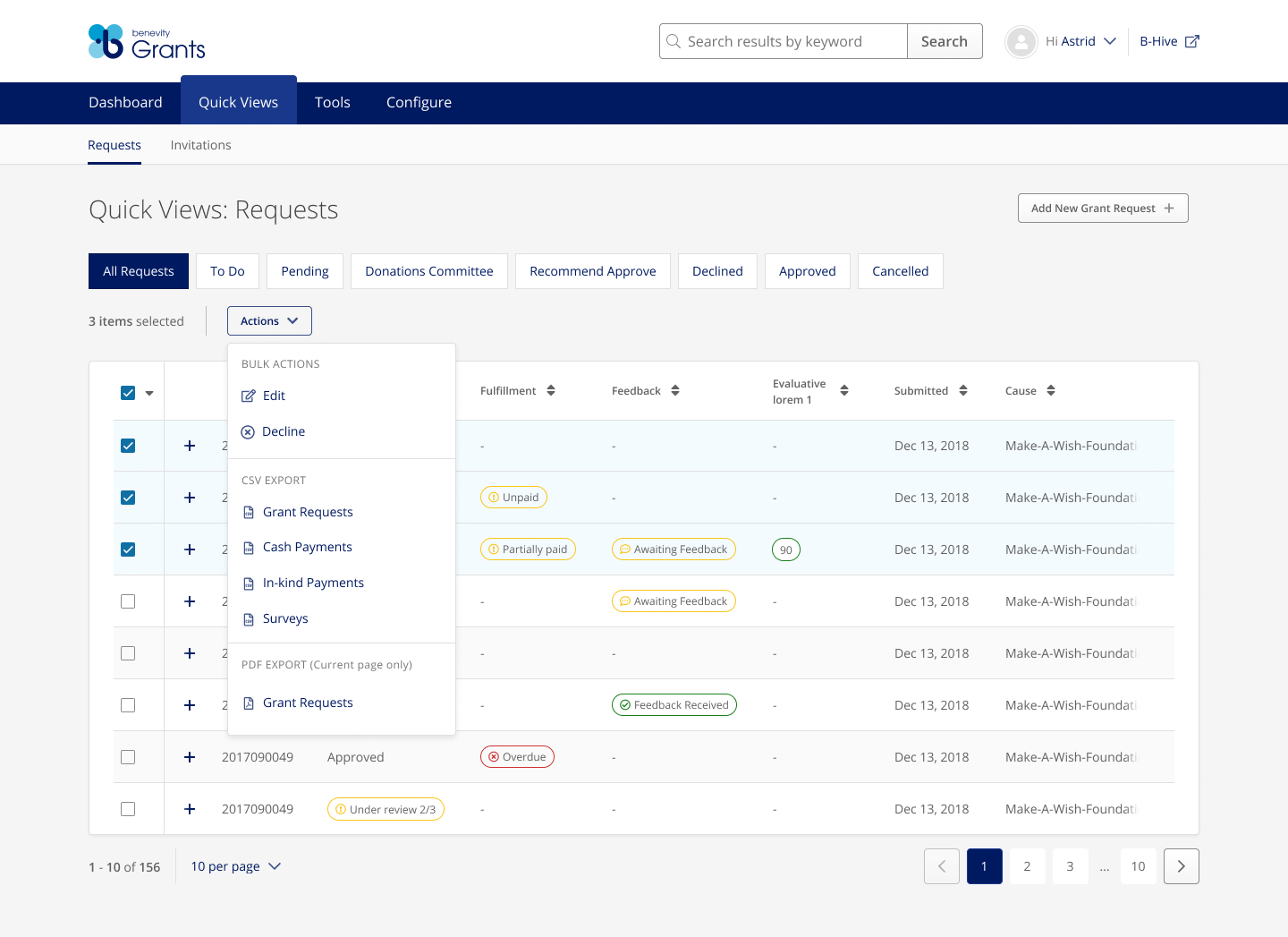
An example of the bulk action availability when multiple lines are selected.
Prototype
You can see a portion of the deceptively simple solution, here. Note that this scales down to device width so may cause issues on mobile for now.
Outcomes
- 20 requests categorized and reviewed: 1-2 hours → seconds.
- Admins: time reclaimed for program strategy; fewer errors.
- Benevity support: Top admin feature request removed, volume down 5%.
- Team lesson: Quantify UX debt as business cost; use it to drive roadmap.